Sunday, 25 April 2010

Exercise - Cropping

(1) The Arun river
I would like to emphasise the row of houses along the river and make the image looks more like a panorama.
-->

(2) duck in a pond

I would like to emphasise on the duck. By cropping it this way, the image draws your eyes to the duck and it makes you try to anticipate what the duck is going to do ... it flew into the water!

-->

(3) Portrait of me
I would like to emphasise the object (me!) as a subject of the image. By cropping it, turning the format from horizontal to vertical, it has changed the object, me, from being part of the environment to a subject as a portrait.

Saturday, 24 April 2010

Exercise - Vertical and Horizontal frames

The way I did this exercise was taking the same photo twice, one vertically and followed by horizontally or sometimes vice versa.
Taking photos vertically, I tend to place objects toward the bottom while taking objects horizontally, I tend to place objects at one third toward left or right.
I enjoyed taking both type of photos. They capture and emphasise different objects.

(1) The vertical image emphasise the left hand vertical buidling while the horizontal image emphasises the length of the bridge from train station.


(2) The vertical image emphasises the image of the building, the tree and the reflection in the water, whilte the horizontal image adds the left hand building to it which doesn't emphasis the same building that much.


(3) The vertical image emphasises the canal while the horizontal image draws the eyes to the bridge.


(4)


(5)


(6)


(7)


(8)


(9)


(10)


(11)


(12)


Conclusion: When placing a vertical shape object in a vertical format, the object will become a subject of the image, but if placing a vertical shape object in a horizontal format, the same object becomes part of the environment or scenery.
Depending on how you want to present the object, the format of the image will help you doing just that!

Tuesday, 13 April 2010

Exercise - Positioning the horizon

The photos were taken at The Beachy Head one of the weekends. I took only 3 photos because there were no point of interest in the image if the line were at other levels.
a) horizon line in the top of frame

This photo emphasize the object on the foreground, the chair. The sky does not seem at all important.


b) horizon line in the middle of frame

This photo equally emphasize both foreground object, the chair, and some of distant the background object, building, the ocean and the sky.

C) horizon line at the bottom of frame

This photo emphasize only the sky. There is no interesting element in the foreground because it is not captured in the frame.

Personally I prefer the 2nd image above because there is a balance between the foreground object and the distant background.
If I want to highlight how the sky had looked, I would have used the 3rd image where the horizon line is at the lower level.

Saturday, 10 April 2010

Exercise - Balance

It is not as easy for me to draw a sketch of balance. Sometimes it looks as if it does not have any balance in it.
I don't think all the photographs need to have balance to be attractive or interesting.

"Sometimes images can be improved greatly by having a secondary point of interest counter balancing the main focal point of an image and providing those ‘empty’ spots with a little weight"
(from http://digital-photography-school.com/balance-in-photography)

It could be object against empty space or one strong colour against other strong colour.

weight = counter weight

some photos are more difficult to sketch the balance than the others depending on where the objects are placed in photos.

The best way to study balance of photo is to look at the photos that have no balance.

Here are some of the photos I took with the sketch I made.


Wednesday, 7 April 2010

Exercise - Focal lengths and different viewpoints

Using 2 set of focal lengths, 18mm and 100mm with a car (again) as my object
standing far away and making a tightly framed composition:
100mm

As I walked closer to the car and made a tightly framed composition:
18mm

These two photos give different feeling.
a) The top one, with 100mm focal length, the car looks quite normal in the scene. It does not emphasise any part of the car. It only gives the impression of the over all car being in the scene, nothing special.
b) The bottome one, with 18mm focal length, the car looks stretched out across the frame. It emphasises the strong presence of the car bonnet and it also gives the impression that the car is about to jump out the frame!

Tuesday, 6 April 2010

Exercise - Focal lengths

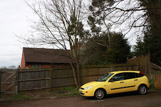
I couldn't find any open view with some details in the distance. I could but I would need to drive some where so i picked the parking area to be my object for my exercise.
Placing my car (again) on the off right hand corner, it is in being part of the scene.
Using my EOS450D with kit lens 18-55mm:
focal length 18mm

focal length 24mm

focal length 30mm

focal length 42mm

focal length 55mm

As I zoomed in the car seem closer. I first thought that it should be the same as moving the camera closer but with the next exercise I did on the same day, i realised how wrong I was!

in this exercise, the car looks exactly the same. it looks like using zoom in tool in photoshop.