Friday, 29 October 2010

Excercise - Colour relationships

First part - combination of primary and secondary colour.

from Micheal Freeman:
If we threat harmony in the sense of pleasing, acceptable relationship, there are two well-established classes,
one is complementary harmony - hues across the colour circle
the other is harmony of similarity (hues from the same sector of the colour circle

Different hues are perceived as having different light values. The German poet and playwright J.W. von Goethe was the first to assign values to hues -
Yellow = 9
Orange = 8
Red = Green = 6
Blue = 4
Violet = 3


According to the colour theory, colours harmonize most completely with each other when their areas are in inverse proportion to their relative brightness.


a) Red : Green = 1 : 1
(equally bright)
I thought this combination was going to be fairly easy since there is green every where, trees, grass, bushes but to find red and green was not so easy. I took a few photos of some red fruits with green leaves but the lighting was not good so it didn't turn out that well.
The image below, I placed a fallen leave on a bush so it produce a nice contrast. I didn't have diffuser or reflector so I had to be careful about the reflection on the leave itself. I had to take it from a certain angle that it didn't reflect so much light off that leave.


b) Orange : Blue = 1 : 2 (orange is as twice as bright as blue)
At the time I look for "orange and blue" combination, the trees started changing colour so I took a lot of pictures of tree top that turned rusty orange contrasting bright blue sky but when my husband and I walking pass this bright blue door, I think i prefered this combination more so i asked him to stand in front of the door for me to take the picture. I adjusted the hue/saturation/lighting and get rid of some blemish on the door so I could have a nice contrast colour image below.


c) Yellow : Violet = 1 : 3 (yellow and violet are extremes of the brightness scale)
I rarely found the combination here anywhere. I did find a flower with this colour but I was on a train so I couldn't take the picture of it.
This image was taken in a Department store. I found a rack of violet jumpers and yellow jumpers so I put one yellow in between violet just to create contrast.


Second part - combinations of two colours or more.
objective is to demonstrate that there is no single "correctness" to complementary colours.

Not long after finishing first part of this exercise (end of November 2010) the weather in England became gloomy and snowy. Everywhere I looked was full of snow with white predominant. I couldn't proceed with this excercise so I had to wait until I could see more colour.

Now, March 2011, after months of waiting and making excuses, I notice that spring is here at last and I can't put this course off any longer. I determine to finish what I started.

d)combination 1 - green yellow with rusty orange
The yellow colour flower seem dominant in this picture even though the area of yellow is not great.


e) combination 2 blue dominant with yellow complement
I took this image below when my husband and I went on cruise in December. The ocean was so dark blue and the sky was light blue contasting with yellow base windmill. The small ship sailing pass, I just had to take the shot. The ship is so small comparing to the windmill.


f) combination 3 blue dominant contrasting with light green
This image below was taken during house hunting in Farnborough. I saw this bright light green colour bush contrasting with the bright blue metal background I couldn't help taking this picture for my homework. I always think about composition and not only colour relationship.


Summary:
This homework has mad me look at the world differently. I constantly analyse how much colour I can see and with certain composition the combination of colour would be perfect for photograph.
I might not be able to remember hue value of all the colour but I get some idea of how which combination it should be to produce colourfull image.

Saturday, 23 October 2010

Excercise - Primary and secondary colours

There are so many colour in nature especially in authumn when all the leaves change colour.
But to find certain colour dominant in an image, it is more difficult. The primary and secondary colour I could think of that occur in nature is colour of trees, grass, flowers, fruits, vegetable, rocks, sky etc
even sky has different colour depending on time of the day.


Primary colour:- Yellow, Red, Blue


Yellow:
At the time of this homework, it's authumn and there is no flower left. The leaves are changing colour but there is no yellow dominant in them. So I could only think of lemon.
And market stalls are great place to find colour.
This image was taken at one market stall in Croydon. I did took a few of lemon from different stalls but I like this one below the most because they stack on top of each other.
as meter reading


+1/2 stop brighter


-1/2 stop darker


Red:
I took this image from one of the market stalls as well. The colour of these tomatoes are so vibrant.
as meter reading


+1/2 stop brighter


-1/2 stop darker


Blue:
I took this image below at Beddington park on Sunday morning. the sky was so clear and the Sun just came up. I didn't have to use PL filter at all.
as meter reading


+1/2 stop brighter


-1/2 stop darker


Secondary colour:- Orange, Violet, Green

Orange:
This image below also was taken at one of the market stalls. I could have taken photos of pumpkin because it's Halloween season but I like this image more because of thos cut in half orange.
as meter reading


+1/2 stop brighter


-1/2 stop darker


Violet:
I didn't think I could find violet at all. I thought all the flowers would have gone by now but luckily I found these flowers in Beddington park one morning. I zoomed in close so the colour could fill the frame. Even though there is some yellow but I think the violet is more dominant in the image.
as meter reading


+1/2 stop brighter


-1/2 stop darker


Green:
The leaves are changing colour but not the one below, yet. I like how the green is not too dark and when it's lit by the morning light, it looks even lighter.
as meter reading


+1/2 stop brighter


-1/2 stop darker


Summary:
The -1/2 darker makes the colour look deeper while the +1/2 brighter tend to wash the colour out.
Some of the images look better with darker such as sky but some look better, in my opinion, with the camera meter reading as is.

Friday, 8 October 2010

Part THREE: Colour -- Exercise: Control the strength of a colour

Using tripod with ISO 100 constant, I took a photo of a painted door which has dark red in colour.

The images were taken in one late afternoon at about 6pm. The painted door was under a cloudy evening sky so the colour itself appeared normal and not too bright comparing to if I had taken during a bright sunny day.

a) f/5.6 1/15 sec
produced the strongest colour
The Brightest area: where the lightest paint appear on the surface
R=114, G=14 and B=12
The darkest area: where the paint is accumulated
R=20, G=16 and B=13


b) f/5.6 1/8 sec
This colour of this image looks closest to the real colour. I think the main reason is that camera will try to average the tone out.
The Brightest area: where the lightest paint appear on the surface
R=170, G=38 and B=26
The darkest area: where the paint is accumulated
R=48, G=24 and B=24


c) f/5.6 1/5 sec

average setting which looks lighter in colour to the real one.
The Brightest area: where the lightest paint appear on the surface
R=216, G=74 and B=72
The darkest area: where the paint is accumulated
R=66, G=31 and B=38
or
R=74, G=19 and B=23


d) f/5.6 1/2 sec

The Brightest area: where the lightest paint appear on the surface
R=255, G=142 and B=155
The darkest area: where the paint is accumulated
R=105, G=35 and B=45


e) f/5.6 1 sec

This image looks like a "washed out" colour, pale and colour nearly disappeared.
The Brightest area: where the lightest paint appear on the surface
R=255, G=195 and B=204
The darkest area: where the paint is accumulated
R=169, G=78 and B=93


Summary:
1)The higher the exposure, the brighter the colour and the RGB value is approaching 255 which means the overall colour is approaching "white"
2)The lower the exposure, the darker the colour and the RGB value is approaching 0 which means overall colour is approaching "black"

Saturday, 31 July 2010

Exercise - Rhythms and patterns

1) Rhythms - to do with movement (of the eye) across a picture
  • Repetition is a necessary ingredient but this alone does not guarantee a sense of rhythm.
  • Repetition is a feature of the way the eye scans the picture as much as of the repetition.
  • Rhythm produces considerable strength in an image. It has momentum and a sense of continuation. Once the eye has recoginzed the repetition, the viewer assumes that the repetition will continue beyond the frame.

I chose an image above to represent rhythm because the flowers are moving along with the wind blowing. When looking at the image, my eye is moving following the stem and along with the movement of the wind.

2) Pattern - static and to do with area


This image was taken at a market. This stall sell fruits and this basket full of orange makes it so "orange"!
I photoshop one of the orange to make it stand out and look more interrupted or breaking the pattern.

Tuesday, 27 July 2010

Exercise - Real and implied triangles

Triangles are not so difficult to find on a day to day life. They are the simplest and the most useful shape.
They are:
1) easy to construct
2) most basic of all geometric shapes having the least number of sides
3) being most dynamic due to diagonal and corners and stable provided that one side is a level base

Real:
a) a subject which is itself a triangle
The image below was taken from top of the train station which is a triangle in itself. It's part of the roof.


b) a triangle by perspective, converging towards the top of the frame
by tilting a camera up taking a photo of a building, it has created a triangle shape by perspective which can easily be done.


c) an inverted triangle by perspective converging towards the bottom of frame

This wasn't easy to start with. I was thinking of pointing the camera downward of a building (opposite of the converge triangle) but if I had to look downward of a building, it would have been quite scary!
Then I went walking around and suddenly look up the ceiling and found inverted triangle!!
This type of triangle, the reverse configuration, has different association: less stable, more aggressive, and contains more movement.

Implied:
this part of the exercise has been more difficult (to me!)
I google "still life" to see other people's works to give me some ideas what I could do with the stuff at home.

a) apex at the top
I have chosen 6 cups and stacked them all up with apex at the top.

I could have chosed 6 black cups with yellow background to creat colour contrast but unfortunately I only have 4 cups of black and 4 cups of white so to balance them, i have chosen 3 cups of each. Because the white cups are bigger, I placed them at the bottom.
I quite like the colour and the result.

b) apex at the bottom

the best way to take the invert triangle is to place a smallest item closer to the camera and place the rest behind. tilting the camera downward to see the small item being an apex at the bottom and the rest being the base at the top.

With the same background, I have chosen rednose comic relief smiley face, black cup and some pecks as my objects and arranged them as described above.

c) 3people making triagle

I can only do this exercise at work since I don't have enough people at home!
I asked three nice ladies to be my model. I did try a few posture and found this one the best in term of creating an implied triangle. The head of the lady standing in the back makes an apex of the triagle while the shoulders or heads of the two ladies sitting make the base of the triangle.

Monday, 19 July 2010

Exercise - Implied lines

This exercise is even more difficult that the last one, Curves.
Implied lines are only imagined lines which are used with some subtlety to direct the viewer's attention.

a) Eye-lines: If the person in the photograph is looking at something, our eyes naturally follow that direction.
b) the extension of visible movement: the eye tends to move ahead
c) a row of points
: the eye also tends to move ahead
d) the extension of a line, or lines that seem to point in a cerain direction

First part:


The above 2 images show the extension of visible movement.
the first one, the bull is likely to go right hand side of the matadore, the eye has led ahead.
the second one, the horses are likely to left hand side of the cowboy while he's moving forward to stop them (?)

Second part:
1)Tube running
The tube is moving forward, the eye is moving ahead.


2) Bird running
Demoiselle Crane was running in curve. The eye is following its movement.


3) Tennis player serving
The tennis player is serving a ball. The eye is following the movement of her arm.


Third part:
Planning to take two photographs with implied lines isn't easy.

a) and eye-line

It's easy to use my husband as an object. I can either have him
  • looking directly at camera which is the always the strongest attractant
  • looking at something in the frame which will cause the eye to follow what he's looking at
  • looking at something outside of the frame which will create some doubt in the viewer's mind of what he's looking at
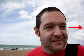
I have chosen to take a photo of him looking elsewhere. The main reason is that I like the way he looks elsewhere and it will make me wondering when I look at the photo later on what he's looking at.


b) the extension of a line, or lines that point
I think lines that point would be something that I would look into it and it would lead me to the object. I planned to take a photo of path, street or fence or something that it leads the eye into it.
Then I found a wooden path that leads the way into or outof the carousel